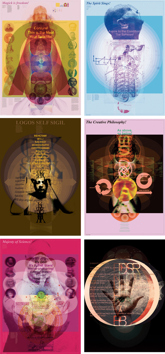
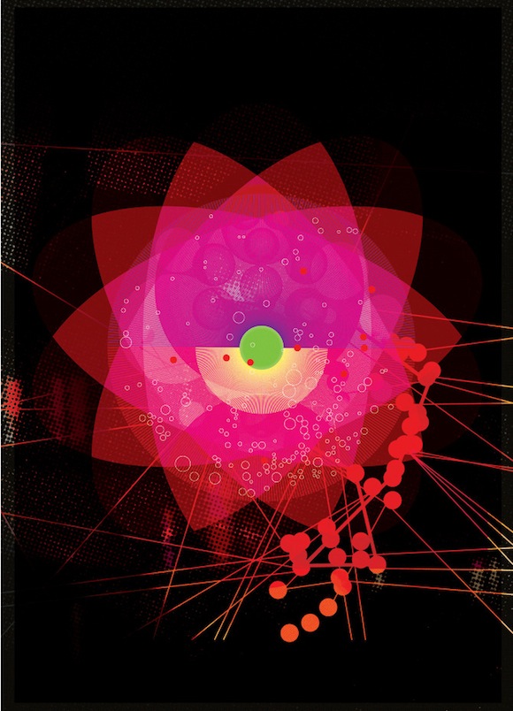
Graham Wood on the series of 24 posters inspired by a 1968 design for Oz magazine
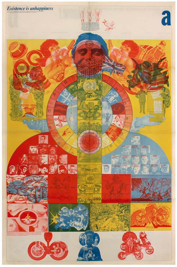
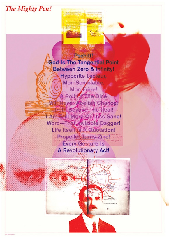
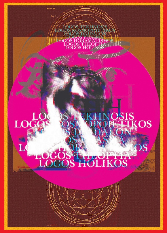
Best known as one of the founders of British design collective Tomato, Graham Wood chose a 1968 poster for underground magazine Oz as the wellspring for a series of 24 poster prints.
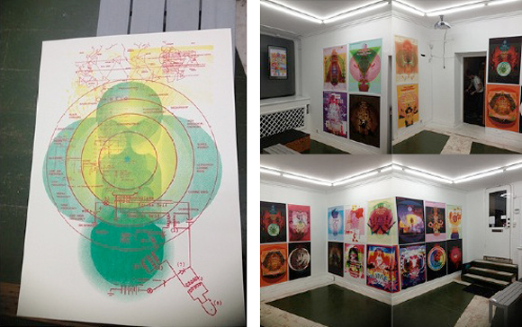
I corresponded with Wood about the ways in which the original artwork- made by Barney Bubbles and his 60s design partner David Wills with a team of contributors – sparked inspiration for the two dozen A0-size posters, which were exhibited in Stockholm in November 2012.
What is it about Existence Is Unhappiness that speaks to you across the decades?
Exuberance, richness, single-mindedness, love, vibrancy, mystery, magic. Life.
Your series refers to some of the key elements (headline typography, border, scale, use/repetition of primary shapes, collage of disparate forms, bold statements, etc). Was it difficult to draw on this piece without sinking into parody and pastiche?
The Oz piece caused me to question WHY existence is unhappiness; what does this mean? Maybe it’s about the bloody-minded aggregation over years of venal and juvenile prejudices some call a ‘personality’. Don’t like egg running into my ketchup, don’t like French food, don’t cut me up on the road, don’t like country music, can’t stand it if the neighbour’s tree branches over my garden, don’t like peas . . . turn it down, turn it off, leave me alone, listen to me, don’t listen to me . . .
One of my pet hates was pastiche and imitation, and coupled with the fact that I wanted to find a copy of Existence is Happiness but had no idea how or where to look, I thought: ‘Why not copy it, make something for my wall/myself and at the same time challenge one of my deepest prejudices when it comes to art and design?’
It was enormously liberating. A joy. I didn’t think twice, it was the intention and the process of working, the whole reason for doing it: no qualms, no hesitation. As long as it was attributed (‘After Barney Bubbles’) I had no second thoughts about immersing in the process.
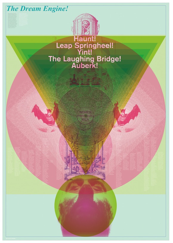
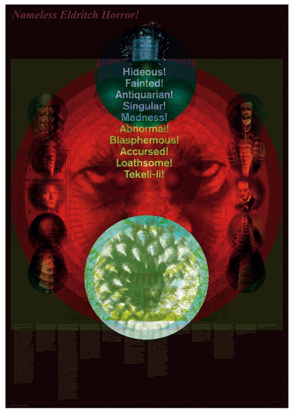
I think the thing that perhaps shifts the images from pastiche (if that is the case: thanks for saying so!) is threefold—subject matter, amount of content, and the evolution of the posters. Each is themed around a subject that’s close to my heart: magic, dreams, love, horror, music etc.
This means the imagery and text is particular and focused: there’s a lot going on in some of these, especially in terms of text, and so the sheer amount of content keeps them away from being too closely overlaid on the original. And the evolution of the aesthetic with each poster over time meant they took on their own identity about halfway through making them. Through repetition they change; the last has the same underlying structure as the first, but looks totally different.
Where is the place for such analogue work (Bubbles, Wills and their team achieved dimension by physically gluing images to Kodatrace film with colours allocated as the work progressed, so it was very much hand-rendered) in the digital age?
Everywhere, anywhere, anytime, it’s possible, in all possible media. It’s rare that anyone would make artwork in the way it was made just over 20 years ago (I’m not sure there are any printers who could use it), but certainly the methods and processes that went into things then are as relevant now (after all there’d be no Photoshop filters without the original processes they mimic).
Drawing, painting, collage, photography, photocopying, screening… you’re always trying to find equivalents for textures that hardly exist anymore, like PMTs (Photo Mechanical Transfers) or blueprints or heat sensitive faxes.
Photographing and/or scanning these things and recombining them in the computer, adding dot screens and making high contrast shapes and marks in vibrant colour – there is no barrier now to play and overlay and recombination. The Mac (in particular) has made things more immediate and to hand.
Who has constant access to screen printing or litho? Who/how many people ever did? How long did it take to draw a simple circle with a Rotring pen on CS10 board? How much time is saved and what can we do with that extra time we have? Trying overlays and colour combinations immediately in any number of iterations. Finding imagery with a quick search and a focused eye. Keeping the first instinct in mind and pursuing it to the nth degree . . . always playing, discovering.
How did the exhibition come about?
I’d always hoped to exhibit them: they’re largish and were made as a set so to have them displayed in the same space is the intention. I approached a number of London galleries, around Shoreditch etc, and had no responses at all. An old acquaintance in Stockholm runs the Scarlett Gallery there and wanted to exhibit them and that was that. Really simple.
Did you know much about Bubbles and his work?
Although I had Ian Dury’s New Boots &Panties album it was his Do It Yourself that made me actively look to see who made the cover: although thinking about it it might have been My Aim is True (by Elvis Costello).
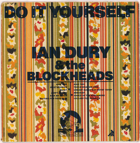
//Wallpaper stock cover, one of 27 variants, design by Barney Bubbles, Ian Dury & The Blockheads, Stiff Records, 1979//
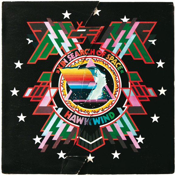
Later, friends who were more into metal had Hawkwind vinyl and I loved In Search Of Space. Then it became about Joy Division and New Order, Simple Minds, Cocteau Twins, Cabaret Voltaire . . . and names such as (Peter) Saville and (Malcolm) Garrett, (Vaughan) Oliver and (Neville) Brody.
Although record sleeves were the focus and ambition in terms of thinking about what I wanted to do at school, I lost track of Bubbles and over the years never went back to investigate, although I got to know some of his contemporaries later on. Your book brought it all back and more, and i had no idea about his work up until the early-mid 70s, and absolutely no idea about the tragic end of the story (Bubbles took his own life in 1983).
What is it about Bubbles work which maintains its interest for contemporary designers?
Having said all I’ve said before, I’m not a massive fan of Bubbles’ entire output. Yes, Existence Is Unhappiness is easily among my five favourite graphic things, but I’m not sure he would be in my top 10 designers (as if anyone cares but anyway…).
That said, his diversity is amazing, his lack of conceit or (visual) prejudice, his willingness to explore beyond known realms, to seemingly allow an aesthetic to grow, arise out of a situation rather than necessarily be imposed on it . . . his ability to create things that transcend.
That’s what it’s all about, isn’t it?
Read about Wood’s career here and Studio Heiss, the practice he founded earlier this year with Mark Cramphorn and Flo Heiss, here.
Read about Unhappiness Is Existence and the other Oz 12 posters at the Barney Bubbles Blog.

